|
    Professional Email Marketing Solutions |
Is Hick's Law Damaging Your Landing Page Results?
Author: crazyegg
There's a rule of thumb marketers have been using for years.
It's called Hick's Law, and whether you know it or not, it has probably lowered the click-through rates on your landing pages.
Here's what you probably already know…
According to Hick's Law, the more choices you give someone, the longer it takes them to decide.
Here's where it gets interesting…
It's easy to misapply Hick's Law and actually hurt your sales. I'm not disputing the wisdom of one page, one offer. But that doesn't mean you need to limit the number of ways you allow visitors to take that offer.
If you want more orders, you need to provide as many ways as possible for prospects to say YES!
Get results with more links, not fewer
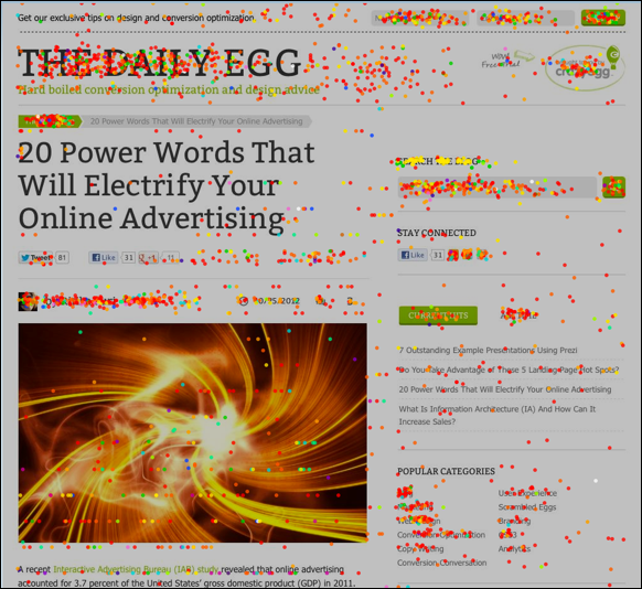
Studies have shown that people often hover their cursor over the section of a Web page they are looking at. As a result, the elements that attract their eye are the elements they click on first.
It may be a product image, a benefits statement, or an image of a happy customer. If it captures their interest — and if it makes them want to buy — that's where they click first.
Here's a Crazy Egg heat map of one of our blog articles. As you can see, people click… well… everywhere,
But what happens if the element they click isn't hyperlinked? Or worse, in the case of an image, what happens if the image is linked to the image location on the server?
Confusion. In many cases, people change their minds and leave. They're interested enough to click once, but not enough to hunt for a link.
Needless to say, more clickable items could easily improve sales. Provided, of course, that you keep Hick's Law in mind and maintain just one simple call to action.
Wondering how to do this tastefully? I mean, we certainly don't want to fill the page with one BUY NOW button after another. Let's take a look at how one of the best direct response companies in the world, Rodale, does it with their Lose the Wheat! Lose the Weight! cookbook promotion.
Here's the landing page in its entirety,
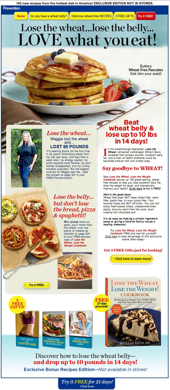
A link every 150 pixels
You won't believe this but there are four links to the order form in the first 600 pixels of this Prevention Magazine landing page.
Have a look,
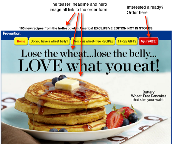
There's only one offer, but four ways to get to it:
- The "Johnson box," or pre-headline teaser.
- The red "Try it FREE!" tab.
- The headline.
- The pancake graphic.
It's powerful copy. Powerful enough that you may decide to buy without having to scroll down. On most other landing pages, you'd have to hunt for a link, but not here.
By hyperlinking all major top-of-the-page elements, Rodale encourages interested buyers to take action immediately.
Notice that only one of these four links looks like a link: the red tab. This is a big reason why Rodale's approach doesn't come off as over-kill. A more clickable landing page doesn't have to look like a link-fest.
Your take-away
Once you've crafted a selling headline, let it sell. Link it to your order page.
Consider adding other persuasive elements that allow people to take action right away. Add a teaser above the headline (sometimes called an "eyebrow" or "Johnson Box") or a subtitle (often called the "deck") below it.
If you can add an image, do. Then follow Rodale's lead and link it to your order page.
Provide lots of links in the body copy
Again, this is hard to believe, but there are six links in the small amount of body copy pictured below. And they all link to the same order form.
See for yourself,
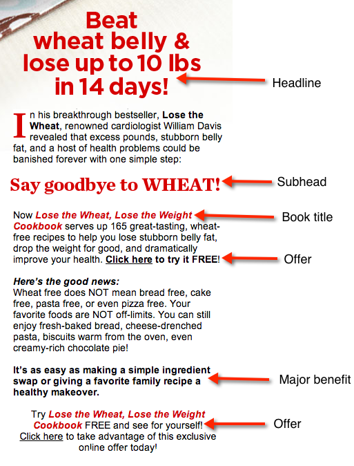
In Rodale's sales pages, the opening (better known as the 'lead') makes up the bulk of the front-page sales copy. Because of that, the copy is loaded with information — and links to the order page.
Notice in the image above there are only two paragraphs without a link. Throughout this copy, nearly every element that catches the eye is hyperlinked:
- Headline.
- Subhead.
- The product name in a different color.
- Bolded paragraph that states the major benefit.
- "Click here" links.
And there's no violation of Hick's law. Quite the contrary, this page is laser focused on a single offer.
Your take-away
There's no reason to make people search for a "Buy Now" button. Subheads, benefit statements and product names are ideal places to insert a link to the order page.
If it catches the eye, make it clickable
Rodale's landing pages use what I call an "evidence box" to add persuasive power. Similar to a sidebar, it's filled with short blocks of copy and images that prove every promise made in the promotion.
In this case, the box contains a testimonial, images of tasty foods you can eat on this diet, a call to action, and linked text — all of them designed to overcome objections.
All together, there are six links:
- The image of the woman.
- The image of the pizza.
- The image of the spaghetti.
- The subhead in the middle of the box.
- The product name, in red.
- The order button.
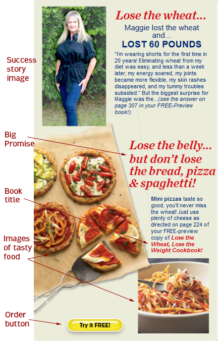
Rodale places this evidence box beside the body copy. So one side of the page provides a written sales pitch, the other a visual presentation. And each supports the other.
The goal of this box is to prove Rodale's promise: that you can leave out the wheat, lose weight, and still eat well. By making it visual, they also make it clickable, and each click directs visitors to the order page.
Your take-away
Pretend you're a first-time visitor to your landing page and look for the elements that catch your eye. If they seem clickable, add a hyperlink.
Try to set off your promises by printing them in bigger fonts or bold colors. If images could provide visual proof, include them as well.
Then link them to your order page so people have lots of opportunities to respond to your offer.
Drive sales to the very last word
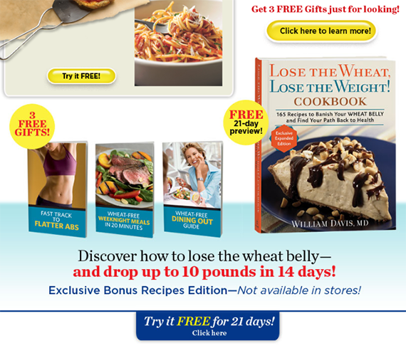
The close of Rodale's promotion is all about clicks. You have:
- Two buttons, both asking for action, both clickable.
- Two "seals" making a promise: "3 FREE GIFTS" and "FREE 21-day preview." Both are clickable.
- Images of the product and the three gifts, all clickable.
- A promise that restates the headline while adding a specific benefit. It's clickable.
- A reminder of how exclusive this offer is. Also clickable.
- One last call to action, the blue button at the bottom of the sales page, that asks for the click.
As you can see, it doesn't take a lot of words to give an effective call to action. It does take a lot of hyperlinks.
Your take-away
Link your call to action, the image of your product and any icons or seals, such as your guarantee, to your order page.
Add "Buy Now" buttons as well. At this point in your promotion, provide as many opportunities to say Yes! as possible.
Whether your offer is as visual as Rodale's cookbook — or not — there's no reason to limit the number of links to your order page. Just make sure they don't all look like linked text.
Keep one focus, one response
Hick's is right about one thing. You can improve results by focusing on a single call-to-action.
But that doesn't mean you only ask for the order one time.
So keep it simple. One message. One call to action. With lots of opportunities for people to accept your offer.
Make it easy for people to buy. Boldly link where no one has linked before. And create the potential for significantly more sales.
About the Author: Kathryn Aragon is an award-winning copywriter, content marketer and editor of the C4 Report. Connect with Kathryn on Twitter.
Related Posts:

Leave a Reply

-MS, Marketing Executive, Trade Show Organizer